Monochrome Mastery: Crafting Bold Simplicity
at Code & Theory
Code & Theory – New York City
Overview
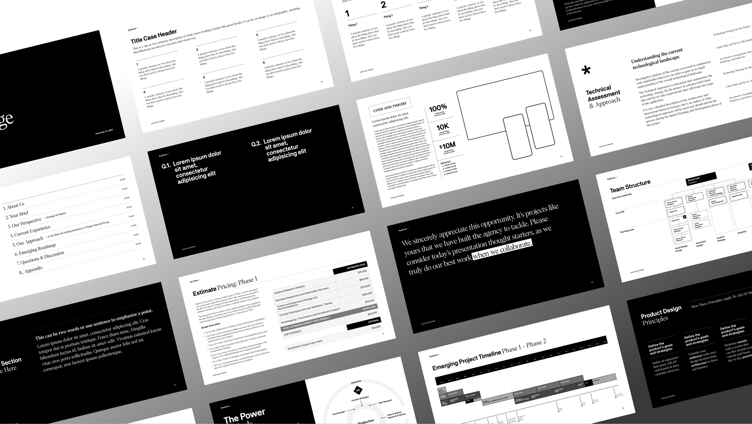
At Code & Theory, I pioneered a content-first slide system—crafted entirely in Figma (before native slide support) and Keynote—to serve both internal strategy sessions and high-stakes client pitches. Charged with transforming complex ideas into compelling decks, I demonstrated that disciplined layout and typographic rigor can elevate storytelling, even within a strictly monochromatic palette.
Challenges & Opportunity
Absence of a branded slide framework meant every deck started from scratch, risking inconsistency and inefficiency.
Clients ranged from in-house innovation teams to global digital brands, each with unique messaging needs yet no unified visual system.
A self-imposed monochrome restriction created the opportunity to prove that minimal color can heighten content impact rather than limit creativity.
Approach & Strategy
Foundation First
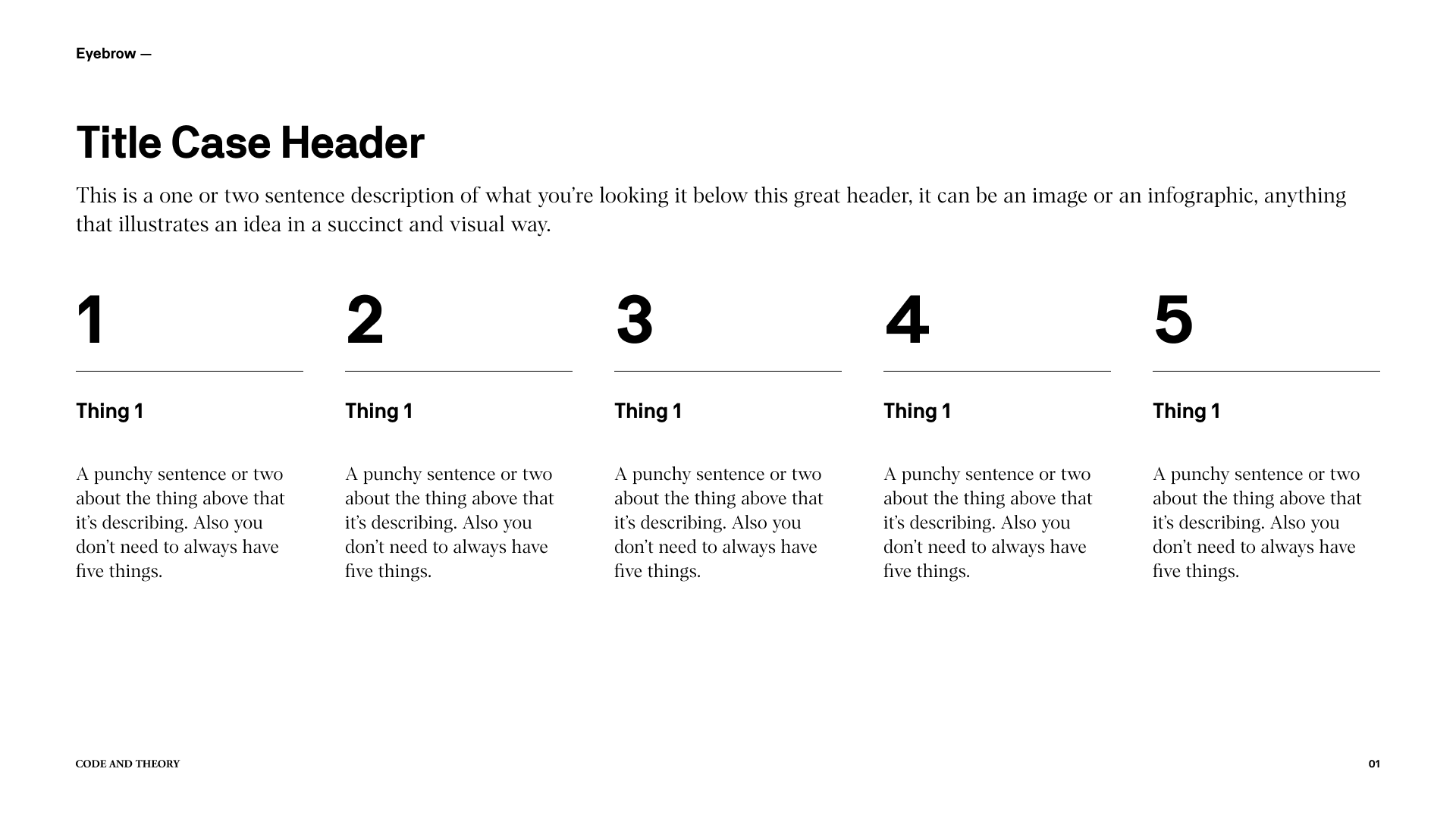
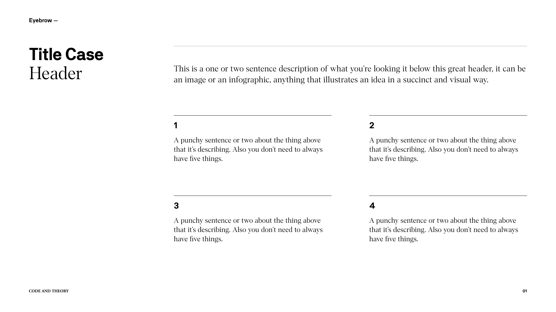
Defined a modular slide grid and typographic hierarchy in Figma, ensuring every slide could flex to different content types—headlines, data tables, process diagrams—without ad-hoc adjustments.
Dual-Tool Workflow
Built and iterated master slides in Figma for rapid prototyping, then seamlessly exported to Keynote for animation and client-ready delivery.
Content-Centric Design
Leveraged whitespace, scale, and font contrast to guide viewers’ eyes through narrative beats. Every element earned its place, transforming each slide into a clear step in a cohesive story.
Monochromatic Discipline
Embraced a black-and-white palette with nuanced grays to establish visual hierarchy, demonstrating that tonal variation alone can provide emphasis and mood.
Deliverables & Toolkit
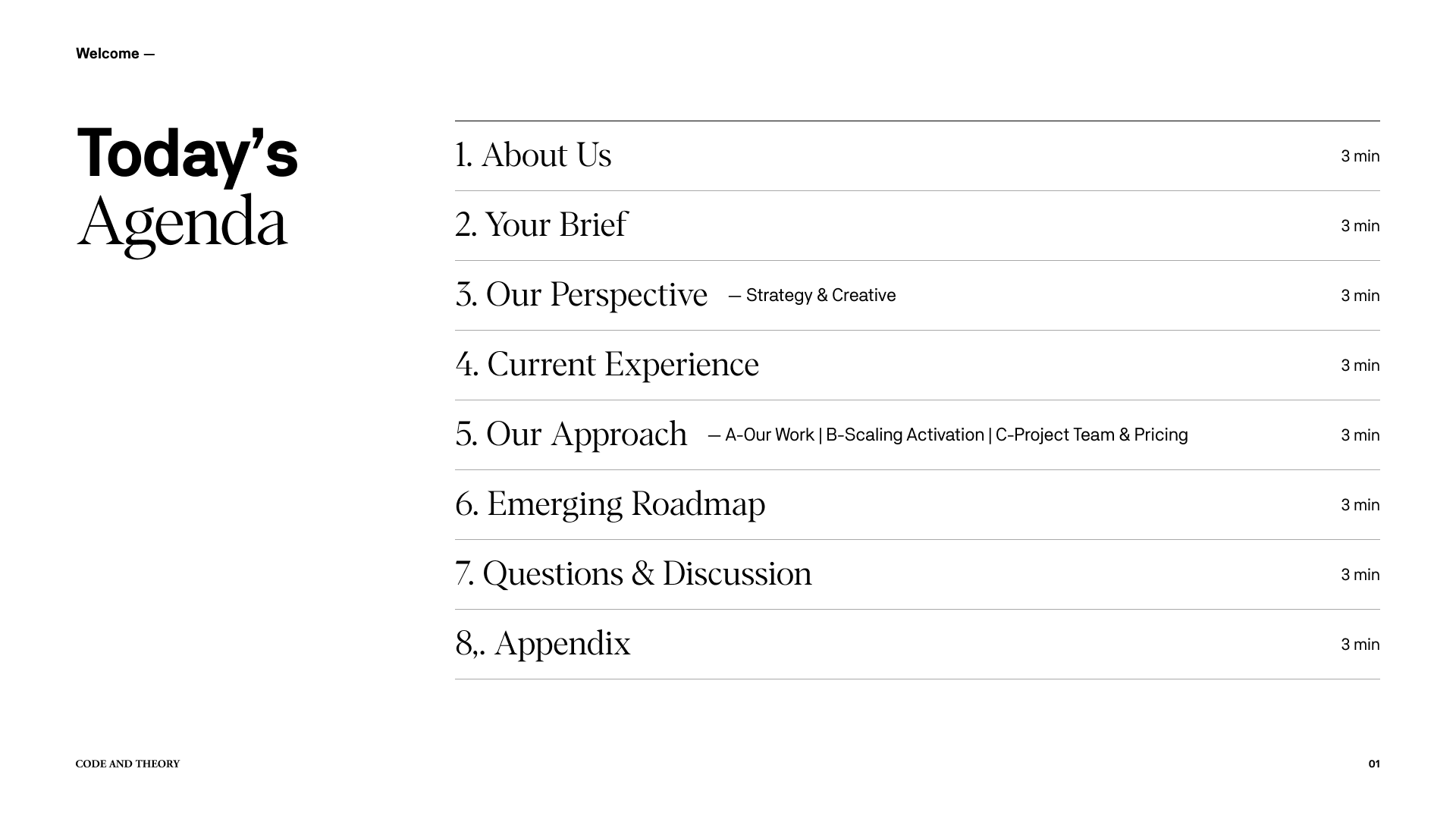
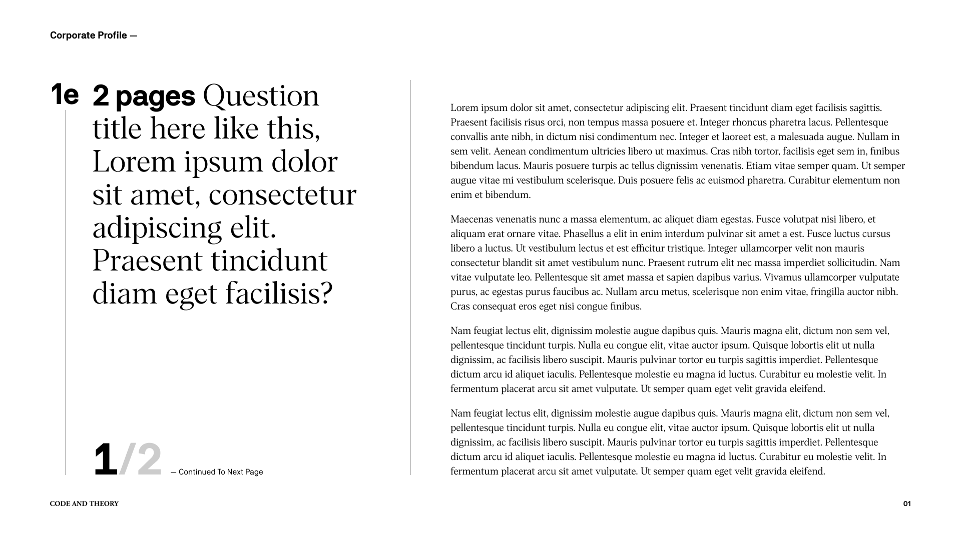
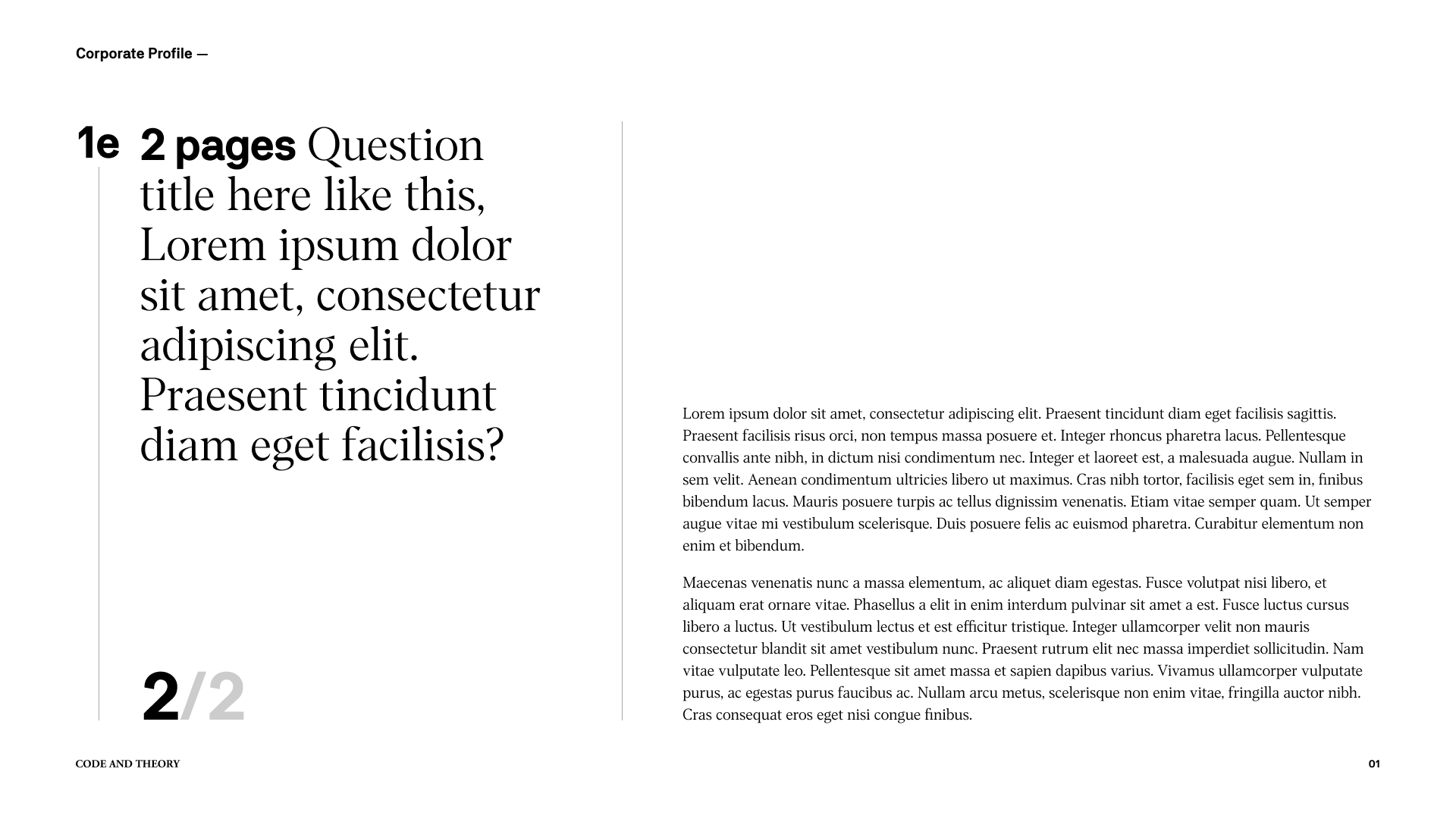
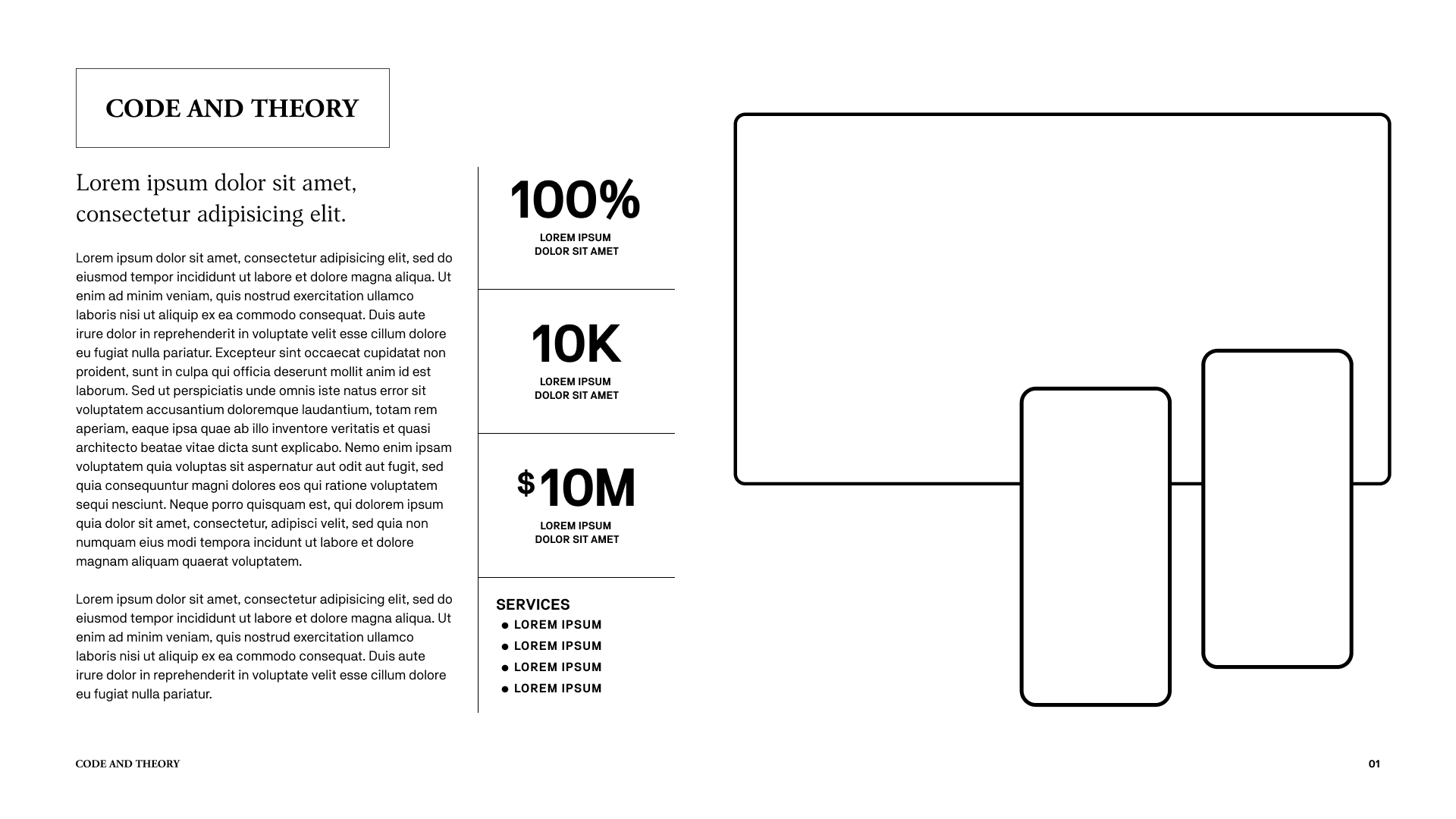
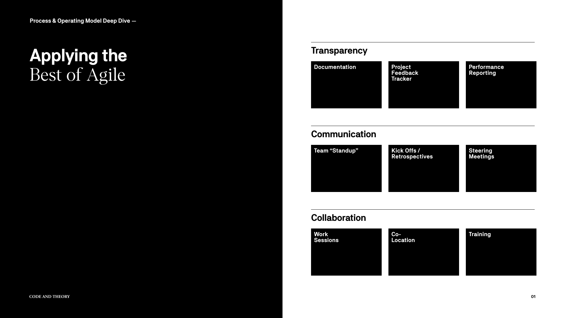
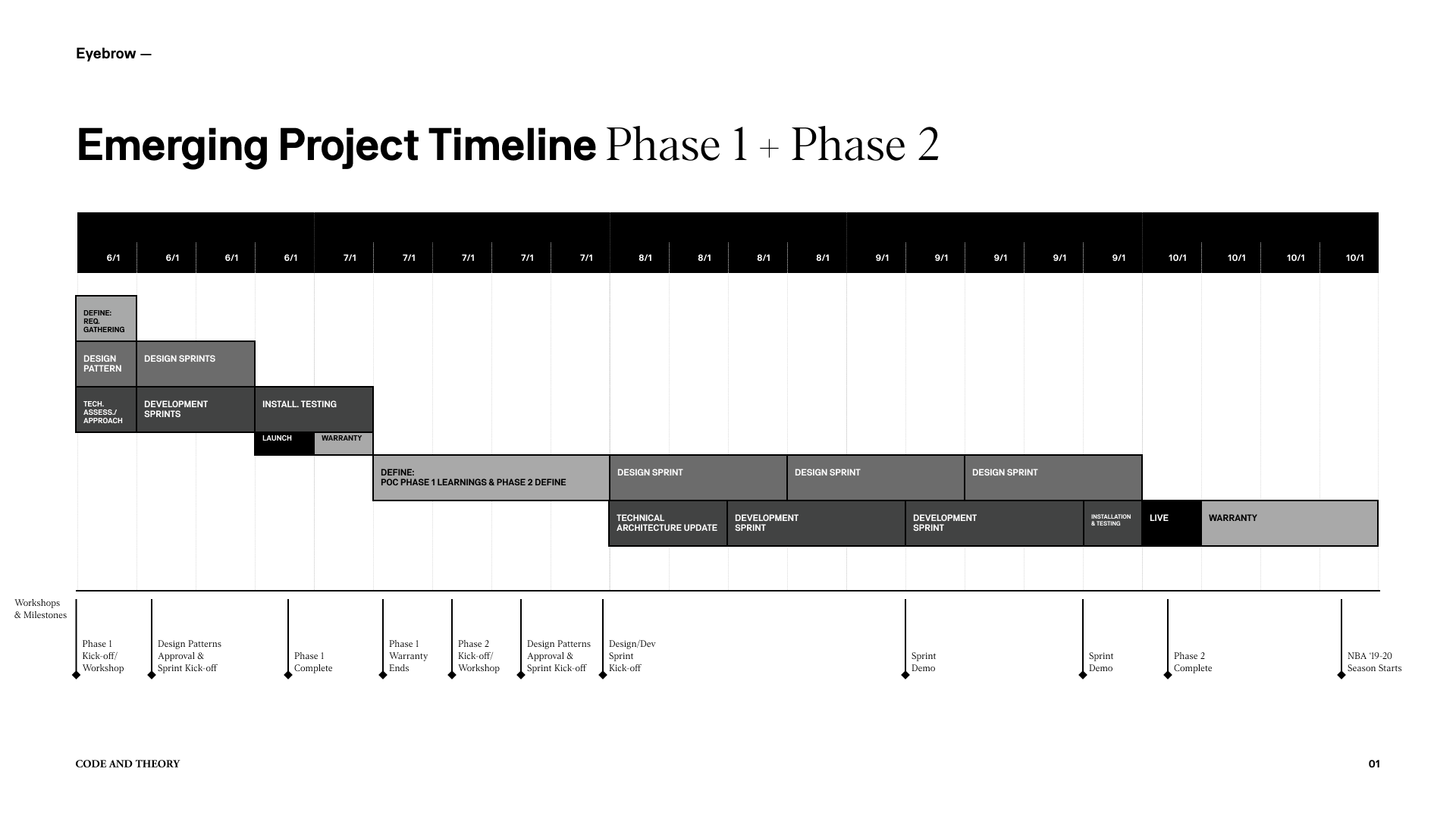
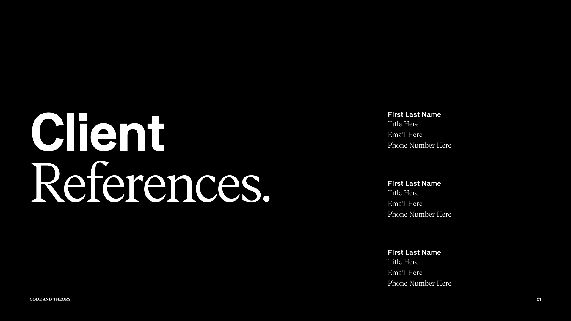
A library of 15+ master slide templates, including:
Title and section headers
Two-column comparison layouts
Data-driven charts and infographics
Quotation and testimonial callouts
A living Figma file with component-based symbols, text styles, and grid styles
Keynote master deck with embedded Typekit fonts and customizable layout overrides
Internal documentation outlining best practices for content placement, slide pacing, and monochrome usage
Outcomes & Skill Growth
Reduced deck-build time by 40%, enabling the team to respond rapidly to last-minute content changes and late-stage client feedback.
Earned recognition from senior leadership for establishing a scalable, on-brand presentation system that became the template for subsequent global pitches.
Honed my ability to distill complex narratives into clean, digestible visuals—a discipline that directly informed my design leadership approach and prepared me for my Associate Director role at WPP Media.
Monochrome Clarity was more than an exercise in minimalism; it taught me that with the right structure and strategic restraint, design elevates substance rather than competes with it.